Nothing Bundt Cakes
Key elements I chose to focus on:
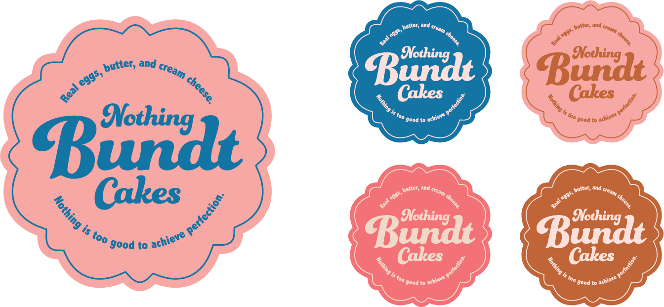
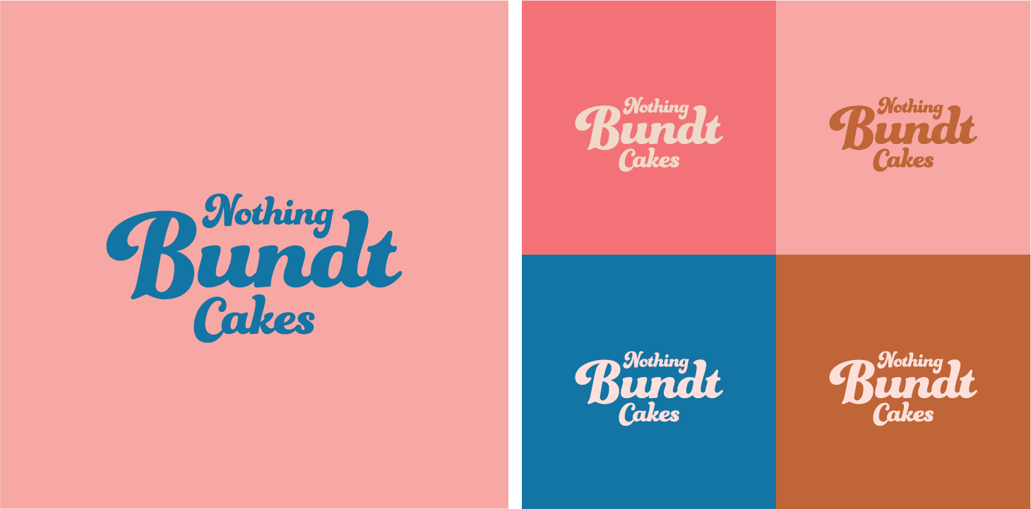
An updated color palette: The blue and brown combo currently utilized by Nothing Bundt Cakes feels a bit dull. Introducing a warmer brown, a pink, and a more saturated blue helps to bring life back to the brand.
Updated typography: I found the type currently utilized tough to read when the logo is displayed at smaller sizes. A thicker and more playful font helps remedy this and brings back a sense of fun.
New iconography: I choose to shift away from the stylized doily icon to a shape that resembles a top-down view of a bundt cake. This allows the icon to work better for social profiles and can easily be translated into signs and stickers.


